Nurse Experience
Lead Product Designer • Float
A dedicated logged-in mobile app for nurses to manage visits, reduce SMS dependence, and improve nurse experience.
Launch a nurse mobile app MVP that strengthens the nurse pool
Design and deliver a nurse-facing mobile app MVP that surfaces critical actions (visits, confirmations, charts links), replaces text blasts with notifications, reduces support overhead, and helps achieve the OKR: Grow MAN (monthly active nurses) to 350 with 20% of active nurses using the app MVP in beta.
Map the existing workflow and surface operational pain points
Discovery revealed several operational and UX issues, including a heavy reliance on SMS text for staffing, fragmented access to visit details, varying levels of technical comfort among nurses, and a high workload for the support team to answer basic questions.
We used stakeholder workshops and design review sessions to prioritize what should be in the MVP versus what needed more discovery.
User interviews & tracking to inform scope
Research included interviews with nurses and post-release feedback sessions. Research-informed feature prioritization, especially around notifications, visit visibility, and simple actions that reduce friction.
- Nurses need quick visibility into available visits and a reliable way to respond.
- Replacing SMS texts with in-app notifications reduces noise and improves tracking.
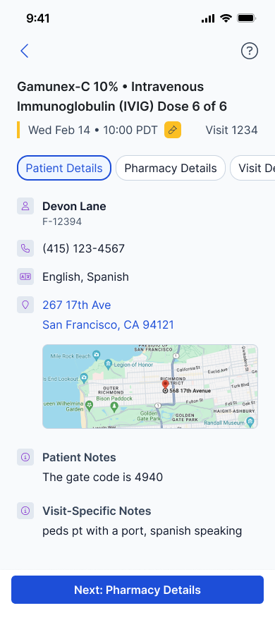
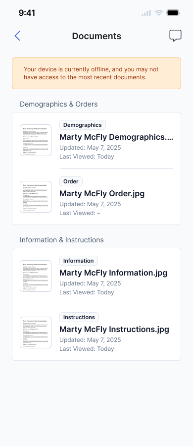
- Visit details (maps, notes) are essential to reduce support contact and create trust.
- Technological variance among nurses requires a forgiving, simple UI.
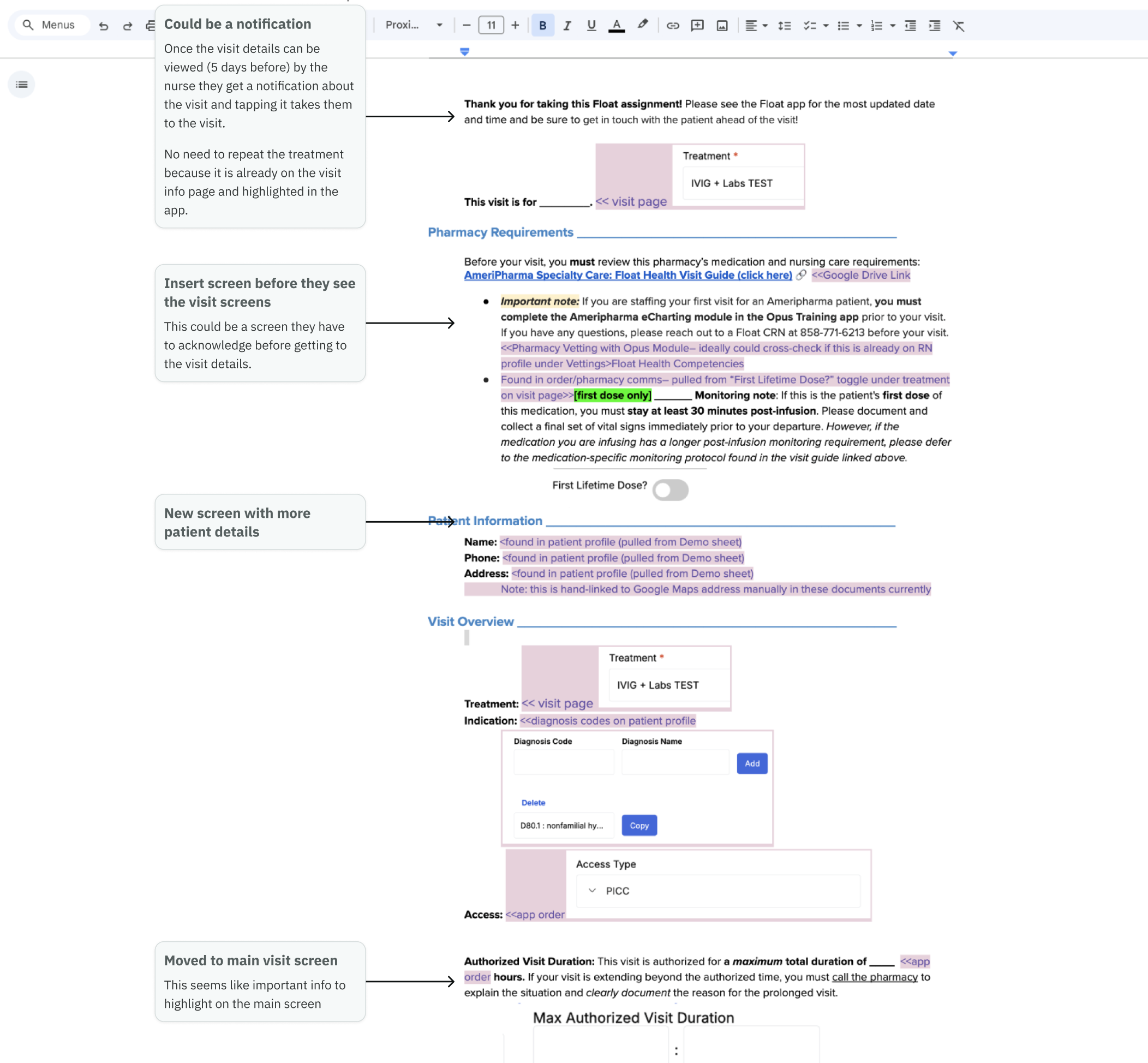
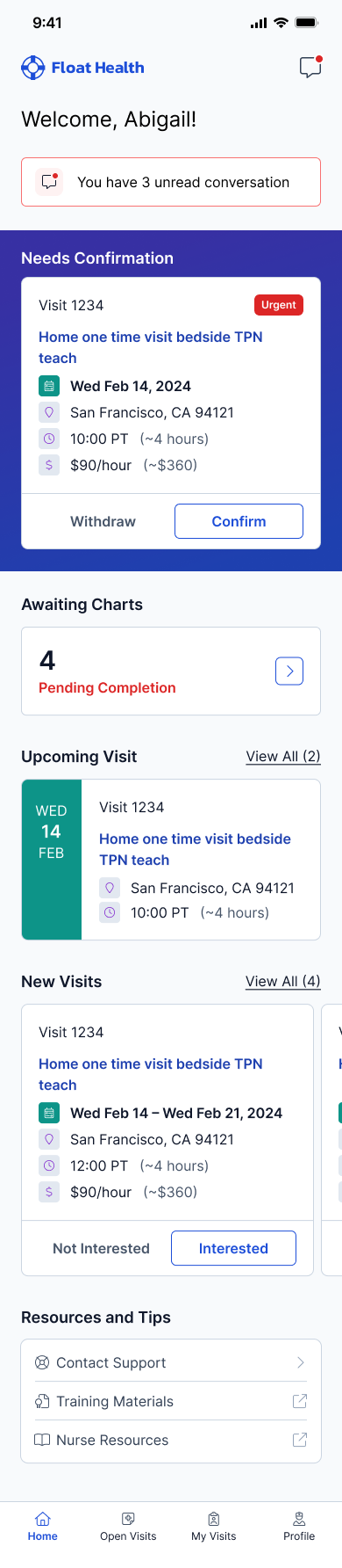
Design for clarity: home, visits, and profile with minimal friction
The UI focused on surfacing required actions and organizing visits into Open, Pending, and My Visits. Key interaction patterns mirrored existing workflows to reduce learning friction:
- Home: Action-needed cards, newly available visit cards, links to training (Opus), support contact.
- Visits: Tabbed top navigation (Open / Pending / My Visits) with counts and empty states; scrollable card lists for quick scanning.
- Visit Actions: Interested modal, confirmation modal, withdraw/dismiss flows (matching existing behavior but refreshed visually).
- Profile: No major changes aside from logout and support info; charts and advanced nurse metrics out of scope for MVP.
Rollout and early tracking to prove adoption and reduce noise
We launched a beta program (up to 60 opt-in nurses) with a how-to guide, tech support scripts, and feedback collection to measure impact on response rate, response time, visits staffed via app, and support burden.
Build a focused MVP that creates immediate operational value
Prioritizing core behaviors and replacing noisy SMS blasts with in-app notifications gave nurses a reliable single source of truth. The MVP approach provided quick wins while preserving a clear roadmap for future features.